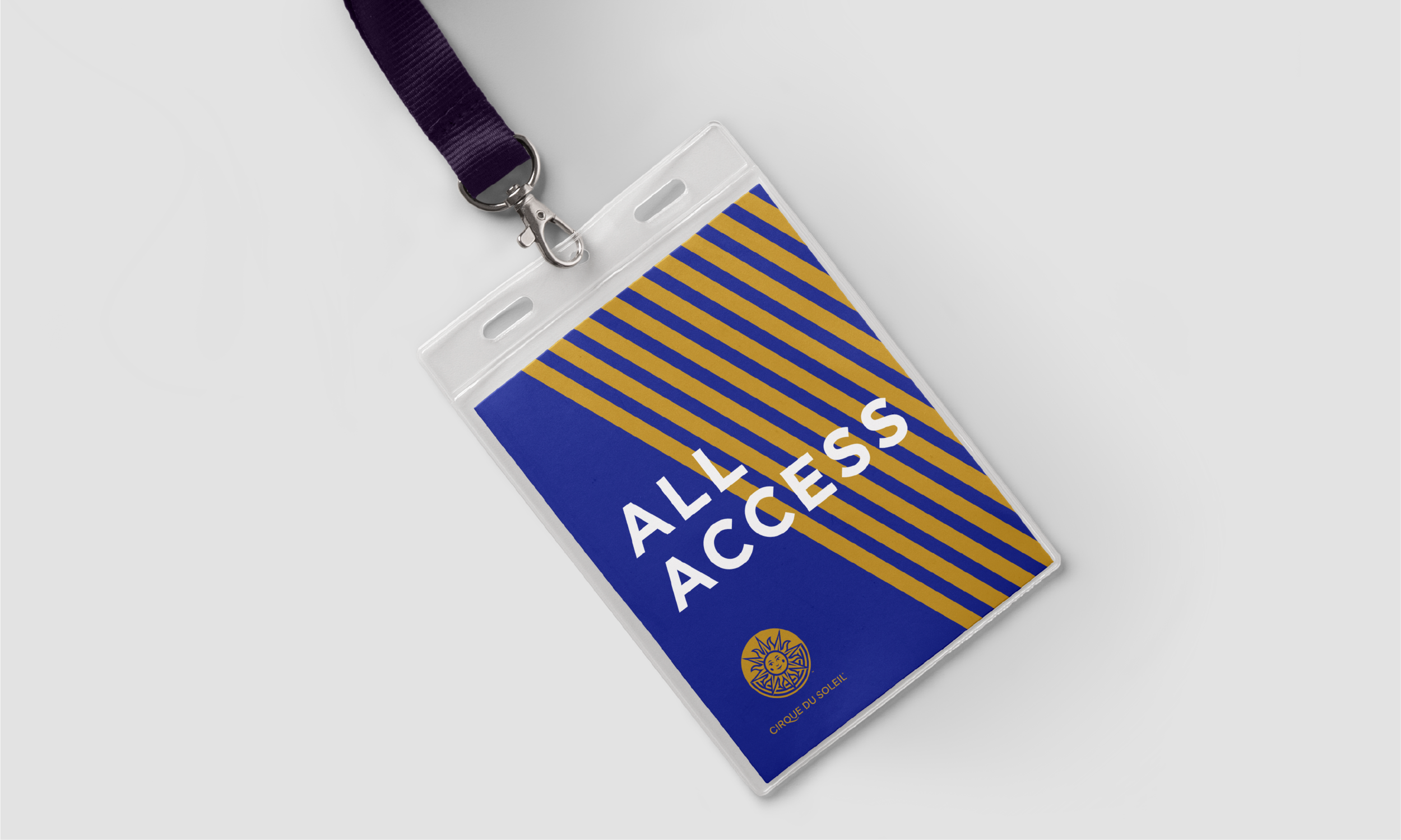
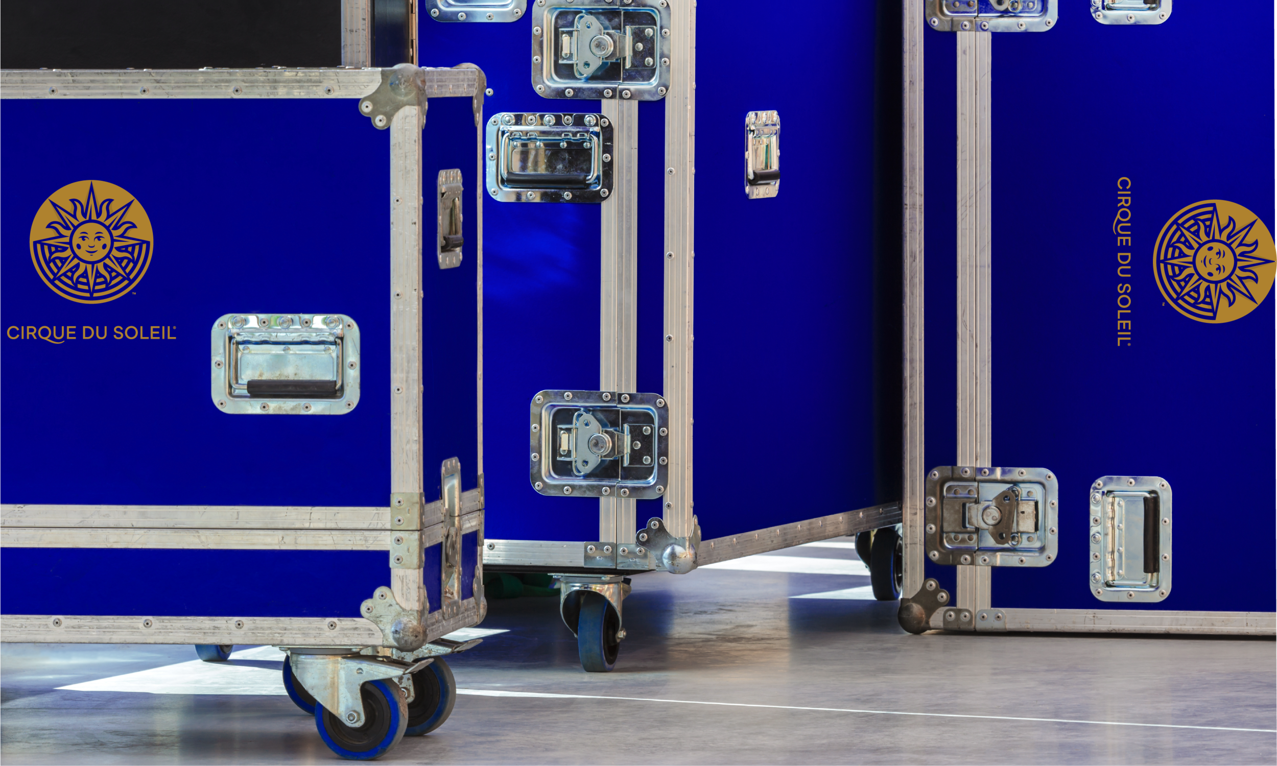
An evolution of the Cirque du Soleil's iconic sun. The redesign supported the expansion of the company's portfolio to represent the Entertainment Group parent entity and continue to be the symbol for the core productions brand.
The sun logo was designed and crafted to leverage the equities from the original symbol, but to modernize it for today's digital, screen-based touchpoints and future applications. The redesign gave it more utility and function and spawned the toolkit of patterns for the broader visual identity.