Google Play
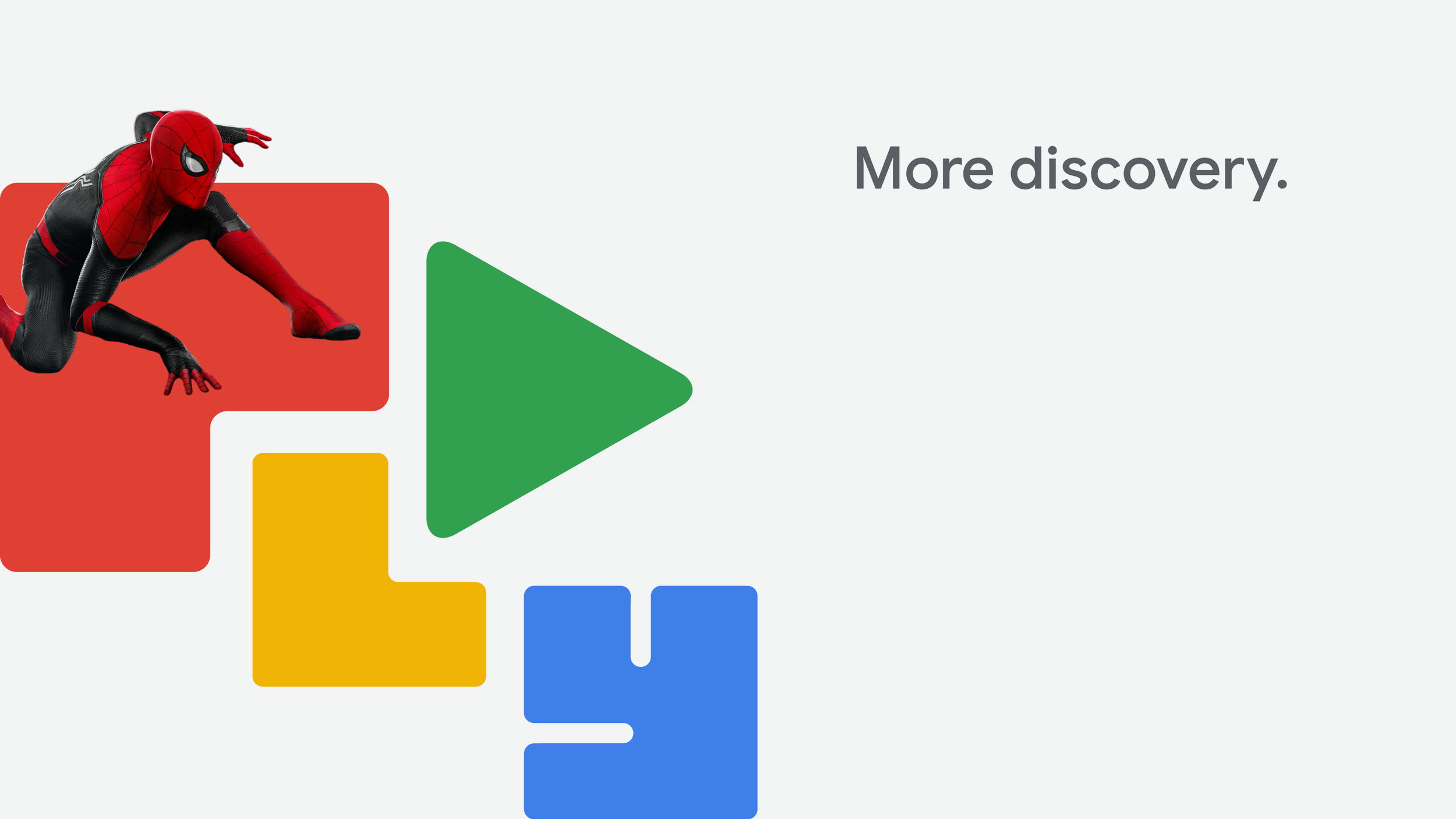
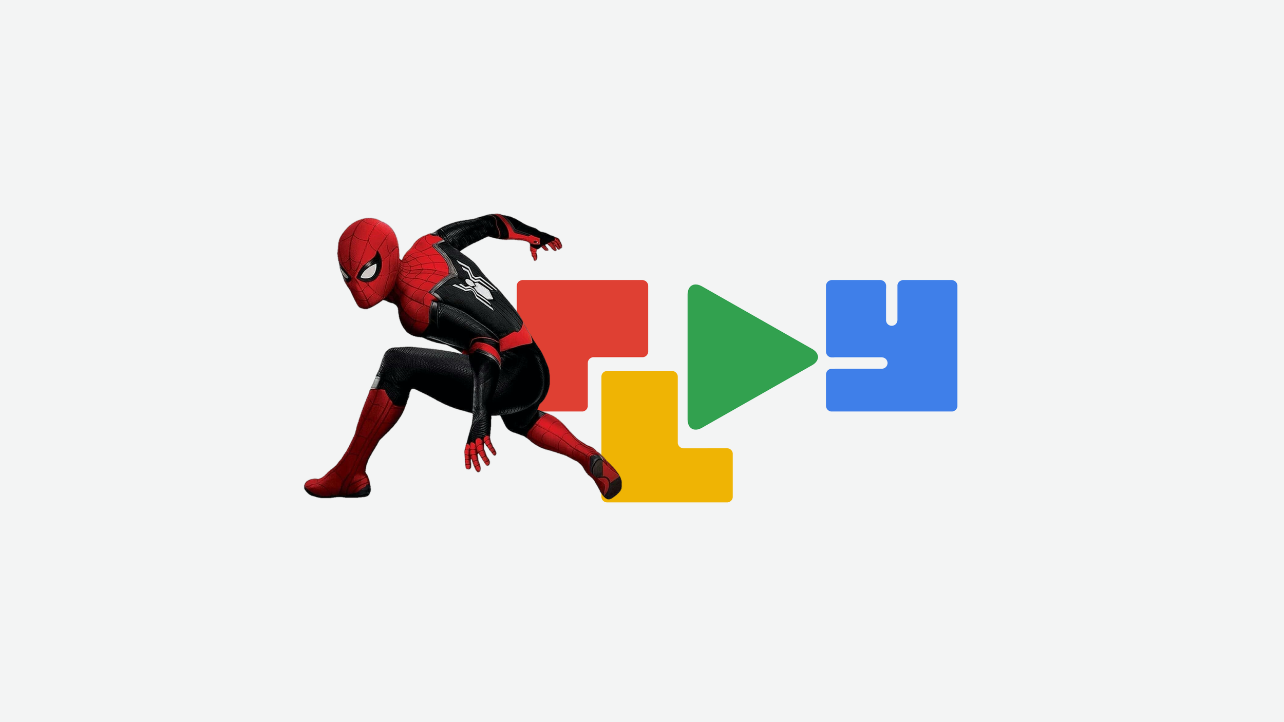
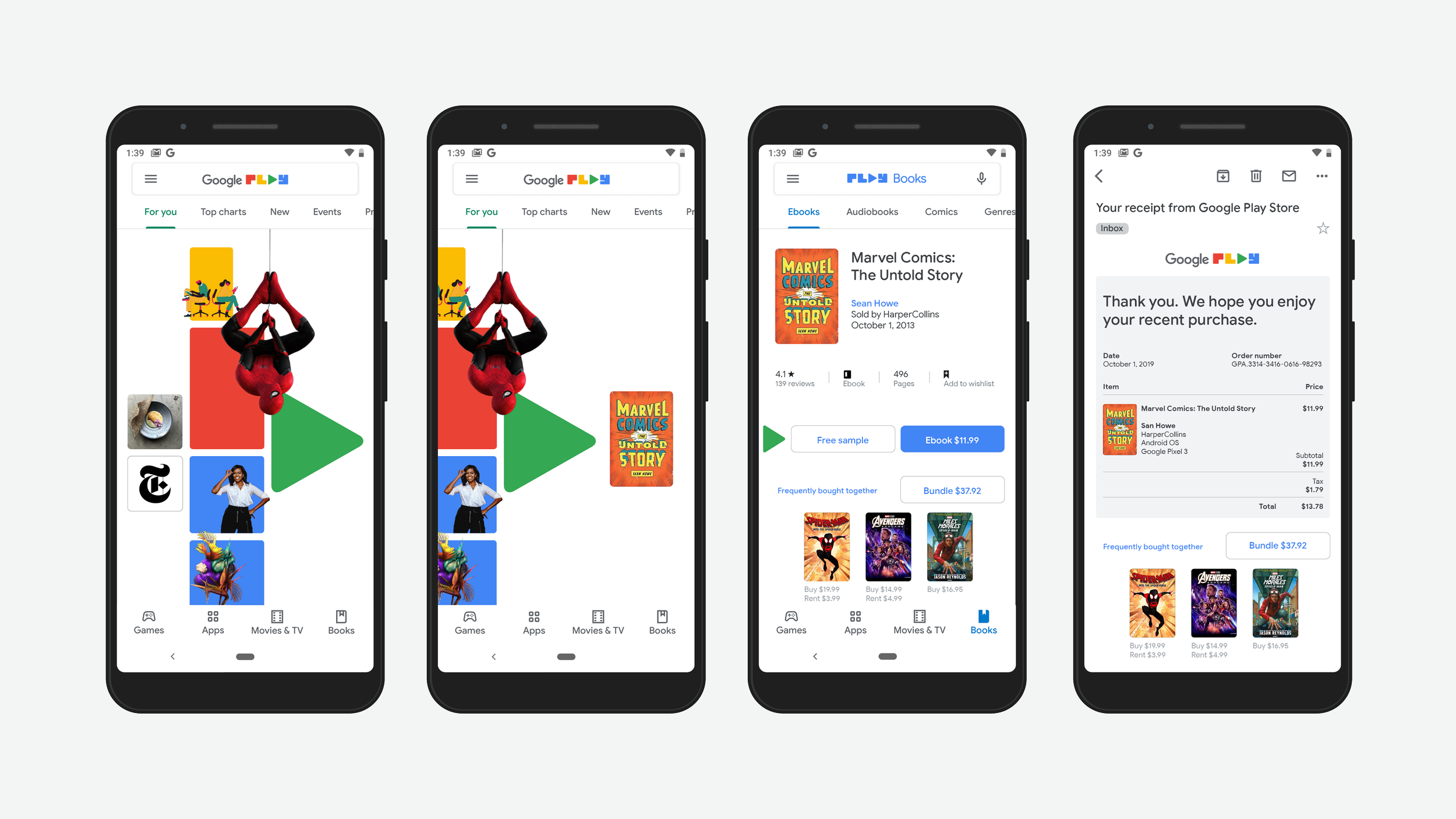
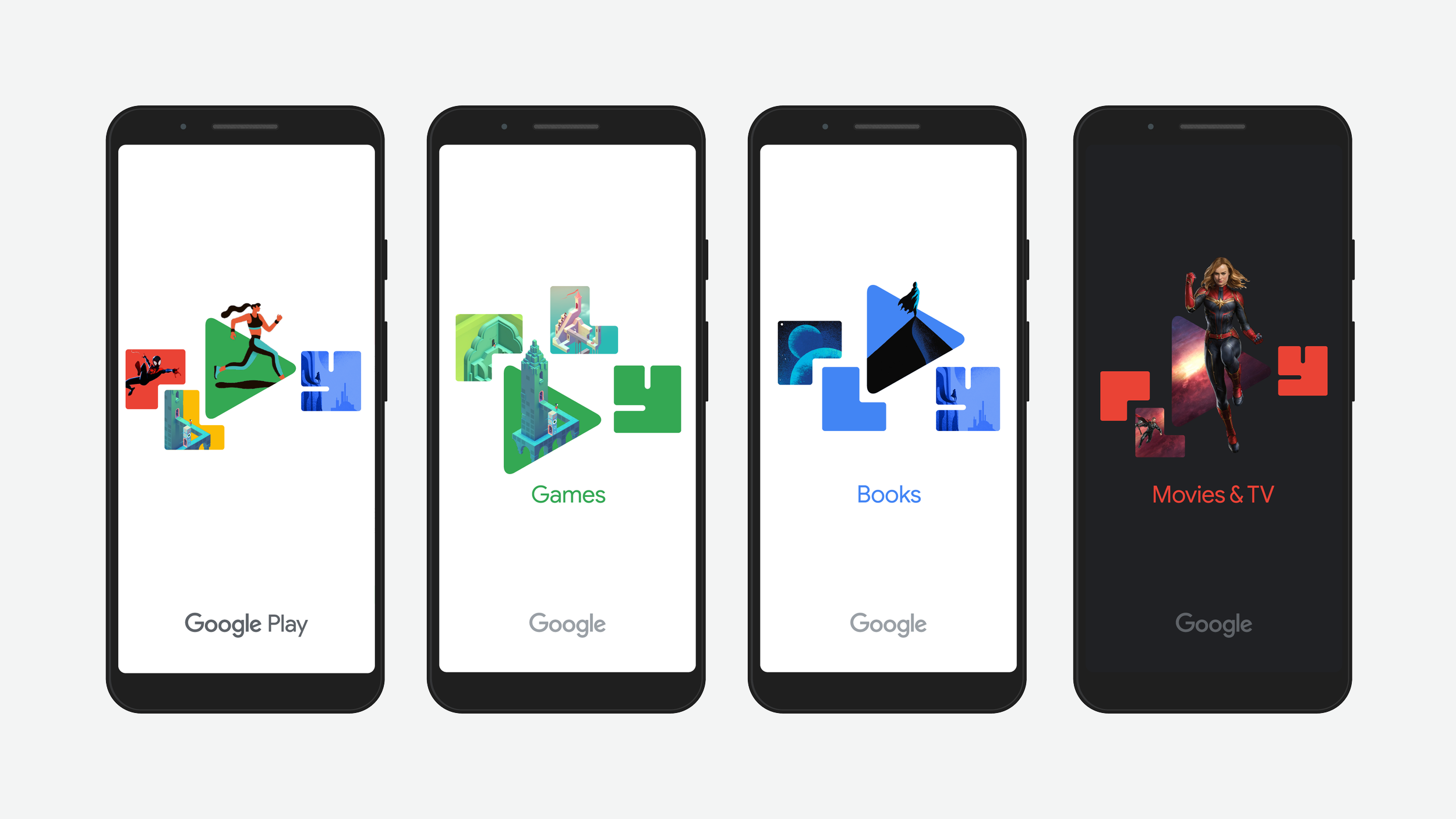
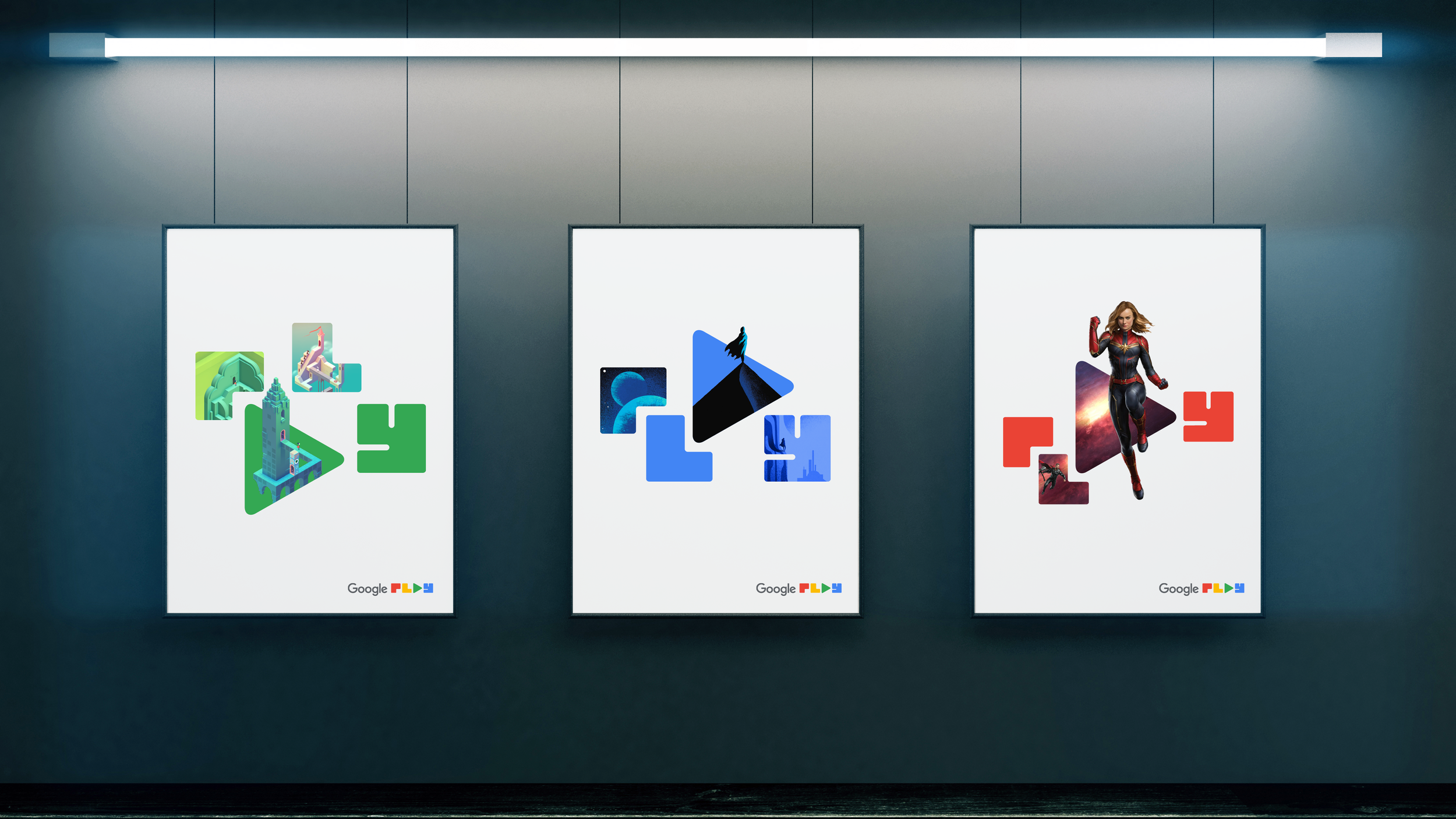
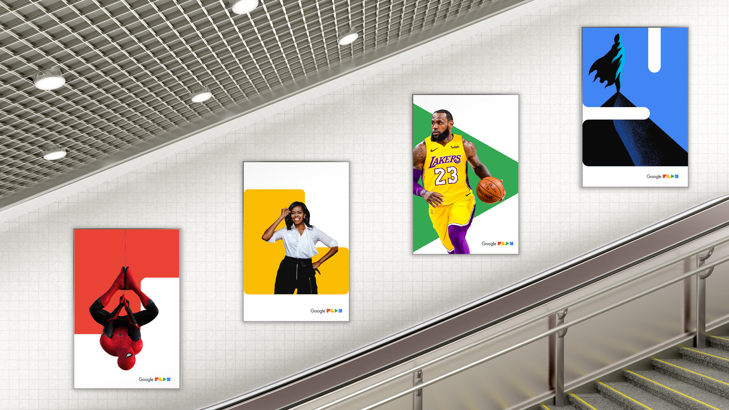
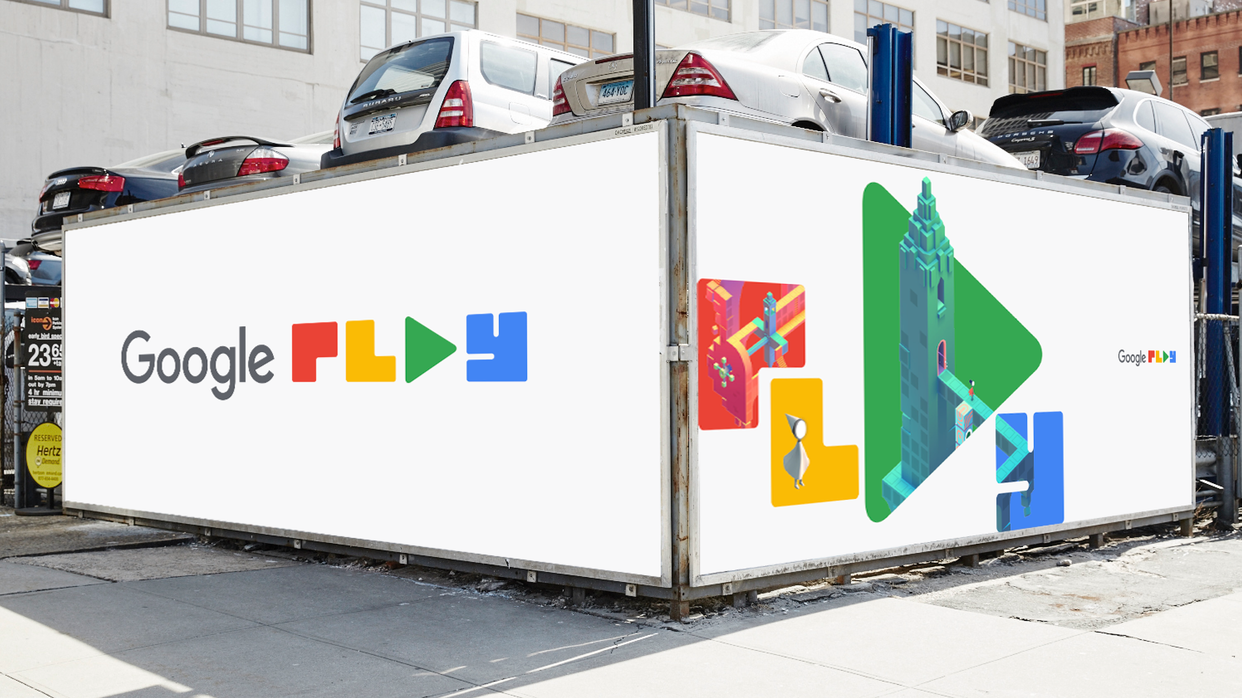
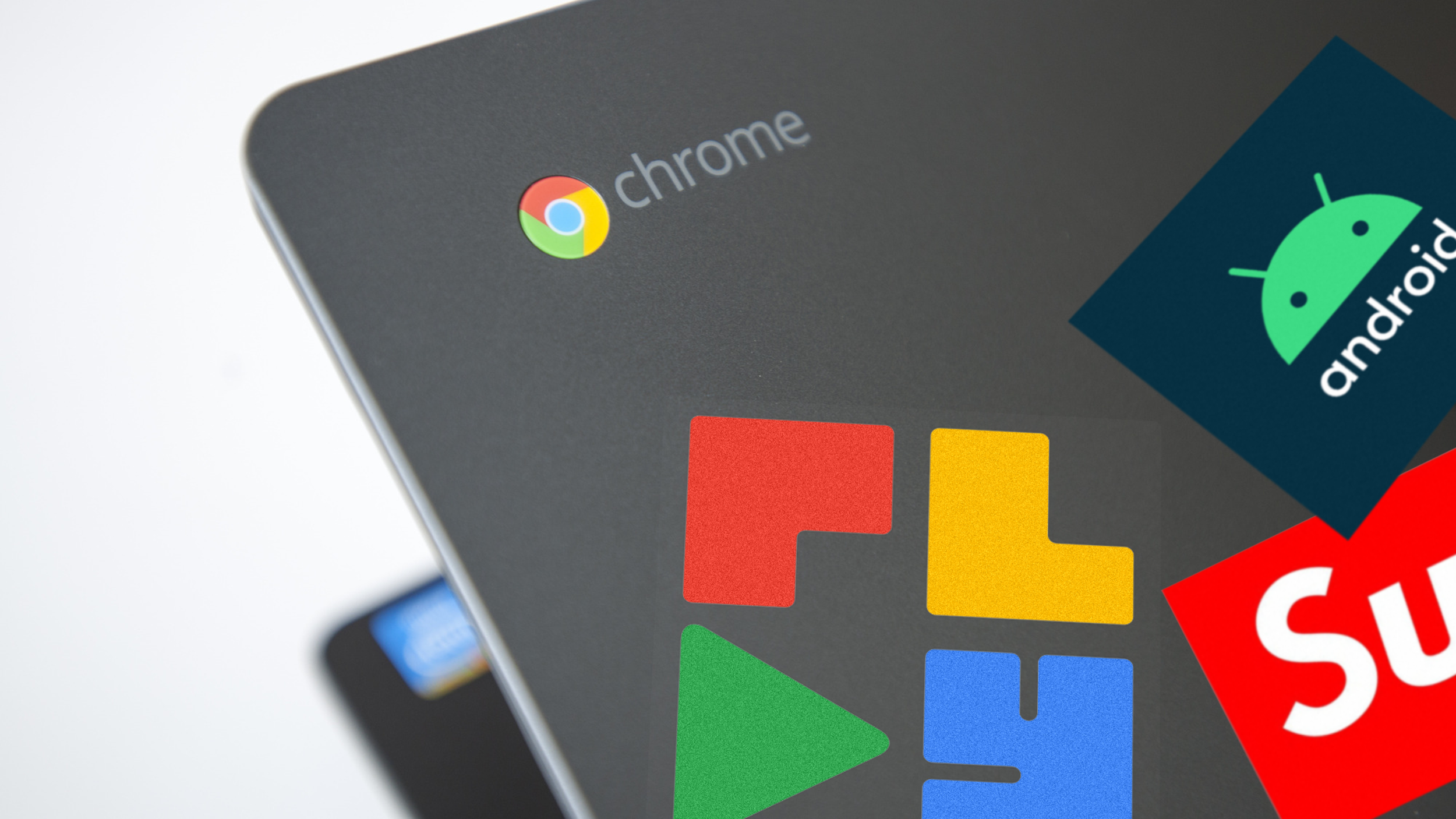
To convey the refreshed value proposition, the visual identity embodied the characteristics of “Joyful + Useful”. Across in-product and marketing, this notion provided the framework for visual design and experience.
Inspired by the Bento box, it translated to a visual structure for content. The containers would scale or flex where content was ‘served-up ‘or emphasized.
Designed at Superunion with Ben Ross.